Apple iOS App Store Settings – Buildbox 3 Manual

By |

Apple iOS App Store Settings

The settings below are part of the General Project Settings that you need to define when exporting your game.

Setting Description
Bundle ID Enter a unique identifier to be embedded into the app, typically using the following format:

com.short-company-name.short-game-name.

Name on Device Enter a short name to be displayed on the device after the game is installed on it.

This name will appear under the game icon.

If it’s too long to display, the device abbreviate it by adding a trailing ellipsis (…).
Leaderboard ID Enter the code name of the leaderboard, which you set up in Apple’s iTunes Connect so the game can use it.
Review Link Enter a link in the App Store that the player can use to provide a review of your game.
Share Message Enter a message to prompt the player to share the game.

Make sure to include a link to your game in the App Store or Play Store.

If you are publishing your game on multiple platforms, consider making this link open web pages instead of an App Store. This will ensure that people with whom the player is sharing the game can access your game from different kinds of devices.

If you want to show the player’s score in this message you can insert the [[SCORE]] tag into your text.

Control Button – Buildbox 3 Manual

By |

Control Button

Add this button to create a UI button that you can use as a control node. Just drag it from the Asset panel to the UI Editor and define the control button  attributes as described below.

After you add a control button to the UI, you need to associate it with the asset that you want to control. For details, see Add Control Button.

Name and Transform Attributes

Option Description
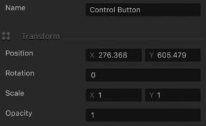
Name Enter a custom name for the button. It will be displayed in the Outliner and in the list of UI buttons in the control node.

Don’t leave this field blank, as you won’t be able to tell what button it is if you hide it.
Position Enter the appropriate values for each axis to specify a precise position for the button on the screen.

You can also drag the button to the desired location directly in the UI Editor.
Rotation Enter a degree value to specify the rotation angle of the button.
Scale Enter a value for each axis to make the button as proportionally large, or wide or narrow as needed.

You can also select the button in the UI Editor and drag its corner handles to resize it as needed.
Opacity Enter a value from 0 to 1 to specify the transparency of the button. For example, if you enter .5, the image will be semi-transparent.

Button Image Attributes

Option Description
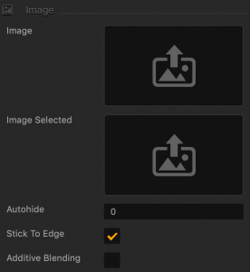
Image Drag a PNG image for the button in its inactive state.
Image Selected Drag a PNG image for the button when it is selected.
Autohide If you want the button to appear momentarily and then fade away, specify the number of seconds for the button to be displayed for before disappearing.

To keep the button displayed on the screen, enter 0.

Stick to Edge Select this checkbox to maintain button’s relative size and position when scaling the screen for different sizes.
Additive Blending Select to add a glow effect overlay to any graphics or 3D objects underneath the button.

Sound and Other Properties

Option Description
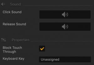
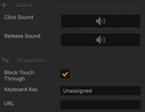
Click Sound Drag an MP3 file with the sound to be made when the player taps the button. See also Adding Music and Sound Effects.
Release Sound Drag an MP3 file with the sound to be made when the player releases the button.
Block Touch Through If this button happens to be stacked on top of another button, and you don’t want the player to be able to tap the button underneath and trigger its action, select this check box.
Keyboard Key Typically applies to Windows exports. Type a key name that will activate the button when the user presses the specified key. In some scenarios, you may also associate it the Back button on the Android devices.


Lock Button Options – Buildbox 3 Manual

By |

Lock Button

This UI Button is locked and inactive when the game starts and allows the player to unlock it by purchase, game progress, or other player actions. To add it to the UI, just drag it from the Asset panel to the UI Editor and define the Lock button  attributes as described below.

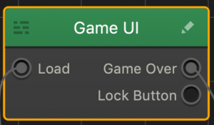
After you drag the button from the Asset panel to the Editor, an additional output appears in the corresponding UI node on the Mind Map. After you rename the button and customize its options, the name of this output will be updated accordingly.

Remember to connect the Lock Button output to the Load output of the World that you want to unlock.

Name and Transform Attributes

Option Description
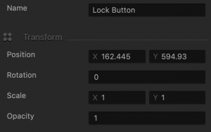
Name Enter a custom name for the button, if needed. It will be displayed in the Outliner.

Don’t leave this field blank, as you won’t be able to tell what button it is if you hide it.
Position Enter the appropriate values for each axis to specify a precise position for the button on the screen.

You can also drag the button to the desired location directly in the UI Editor.
Rotation Enter a degree value to specify the rotation angle of the button.
Scale Enter a value for each axis to make the button as proportionally large, or wide or narrow as needed.

You can also select the button in the UI Editor and drag its corner handles to resize it as needed.
Opacity Enter a value from 0 to 1 to specify the transparency of the button. For example, if you enter .5, the image will be semi-transparent.

Button Image Attributes

Option Description
Image Drag a PNG image for the button in its inactive state.
Image Selected Drag a PNG image for the button when it is selected.
Locked Image Drag a PNG file for the button to display when it is locked.
Locked Image Selected Drag a PNG file for the button when it is still locked but tapped by the player.
Autohide If you want the button to appear momentarily and then fade away, specify the number of seconds for the button to be displayed for before disappearing.

To keep the button displayed on the screen, enter 0.

Stick to Edge Select this checkbox to keep the relative size and position of the button when scaling the screen for different sizes.
Additive Blending Select to add a glow effect overlay to any graphics or 3D objects underneath the button.

Sound and Other Properties

You may find this video helpful in understanding how to make the appropriate selections in this section.
Option Description
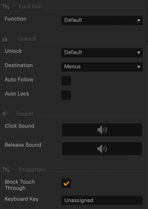
Function Select how the new World or UI screen should be loaded when the selected event occurs and the Event Observer is triggered:

  • Default—load World or UI at the beginning.
  • Start Checkpoint—load World at the point where a player may restart if their character is killed or they lose the game.
Unlock Select a method for players to unlock this button:

  • Default—use an Unlock logic asset.
  • In Game Currency—the player must use game currency to unlock the functionality.
  • In App Purchase—the player must make a purchase in the App Store.

Depending on your selections, additional fields may appear.

Price This field appears when you select In Game Currency in the Unlock list above.

Enter the amount of in-game currency required to unlock the button.

Store Identifier This field appears when you selectIn App Purchase in the Unlock list above.

Enter the App Store ID where the player must make a purchase to unlock the button.

Destination Select where the player should be taken after the button is unlocked:

  • Menus—creates an output that can connect to another UI.
  • Scene—the current scene will remain on the screen.
  • Next Scene—the next scene will be displayed.
Auto Follow Select to automatically take the player to the specified destination as soon as the player unlocks the button.
Auto Lock Select to lock this button every time the game moves to another World or UI Screen.
Click Sound Drag an MP3 file with the sound to be made when the player taps the button. See also Adding Music and Sound Effects.
Release Sound Drag an MP3 file with the sound to be made when the player releases the button.
Block Touch Through If this button happens to be stacked on top of another button, and you don’t want the player to be able to tap the button underneath and trigger its action, select this check box.
Keyboard Key Typically applies to Windows exports. Type a key name that will activate the button when the user presses the specified key. In some scenarios, you may also associate it the Back button on the Android devices.


URL Button Options – Buildbox 3 Manual

By |

URL Button

This UI Button allows the player to go to the web pages specified by the URL. To add this button to the UI Editor, drag it from the asset panel to the grid and enter the URL address in the URL attribute.

Name and Transform Attributes

Option Description
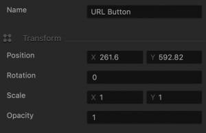
Name Enter a custom name for the button, if needed. It will be displayed in the Outliner.

Don’t leave this field blank, as you won’t be able to tell what button it is if you hide it.
Position Enter the appropriate values for each axis to specify a precise position for the button on the screen.

You can also drag the button to the desired location directly in the UI Editor.
Rotation Enter a degree value to specify the rotation angle of the button.
Scale Enter a value for each axis to make the button as proportionally large, or wide or narrow as needed.

You can also select the button in the UI Editor and drag its corner handles to resize it as needed.
Opacity Enter a value from 0 to 1 to specify the transparency of the button. For example, if you enter .5, the image will be semi-transparent.

Button Image Attributes

Option Description
Image Drag a PNG image for the button in its inactive state.
Image Selected Drag a PNG image for the button when it is selected.
Autohide If you want the button to appear momentarily and then fade away, specify the number of seconds for the button to be displayed for before disappearing.

To keep the button displayed on the screen, enter 0.

Stick to Edge Select this checkbox to keep the relative size and position of the button when scaling the screen for different sizes.
Additive Blending Select to add a glow effect overlay to any graphics or 3D objects underneath the button.

Sound and Other Properties

Option Description
Click Sound Drag an MP3 file with the sound to be made when the player taps the button. See also Adding Music and Sound Effects.
Release Sound Drag an MP3 file with the sound to be made when the player releases the button.
Block Touch Through If this button happens to be stacked on top of another button, and you don’t want the player to be able to tap the button underneath and trigger its action, select this check box.
Keyboard Key Typically applies to Windows exports. Type a key name that will activate the button when the user presses the specified key. In some scenarios, you may also associate it the Back button on the Android devices.
URL Enter a complete URL address of the web page or an app in a Store that you want the players to visit when they tap or click this button.


Purchase Button – Buildbox 3 Manual

By |

Purchase Button

Add this button to allow the player to remove ads or purchase items  typically found in a game shop screen or elsewhere in your game. Just drag it from the Asset panel to the UI Editor and define the purchase button  attributes as described below.

Important: The Purchase Button is only available for Buildbox Pro users.

Name and Transform Attributes

Option Description
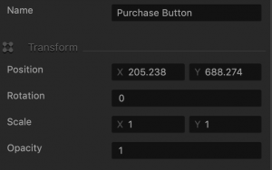
Name Enter a custom name for the button, if needed. It will be displayed in the Outliner.

Don’t leave this field blank, as you won’t be able to tell what button it is if you hide it.
Position Enter the appropriate values for each axis to specify a precise position for the button on the screen.

You can also drag the button to the desired location directly in the UI Editor.
Rotation Enter a degree value to specify the rotation angle of the button.
Scale Enter a value for each axis to make the button as proportionally large, or wide or narrow as needed.

You can also select the button in the UI Editor and drag its corner handles to resize it as needed.
Opacity Enter a value from 0 to 1 to specify the transparency of the button. For example, if you enter .5, the image will be semi-transparent.

Button Image Attributes

Option Description
Image Drag a PNG image for the button in its inactive state.
Image Selected Drag a PNG image for the button when it is selected.
Autohide If you want the button to appear momentarily and then fade away, specify the number of seconds for the button to be displayed for before disappearing.

To keep the button displayed on the screen, enter 0.

Stick to Edge Select this checkbox to keep the relative size and position of the button when scaling the screen for different sizes.
Additive Blending Select to add a glow effect overlay to any graphics or 3D objects underneath the button.

Action and Sound Attributes

Option Description
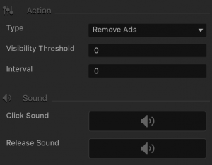
Type Currently, only one option is available, Remove Ads.
Visibility Threshold To make the button appear only after the player views the UI where it’s located certain number of times, enter the number of required views. Otherwise, leave it at 0, and the button will be displayed as soon as the player views this UI.
Interval If you want the button to disappear after the player clicks it, enter the number of seconds, typically 1 or 2, after which the button should disappear.
Click Sound Drag an MP3 file with the sound to be made when the player taps the button. See also Adding Music and Sound Effects.
Release Sound Drag an MP3 file with the sound to be made when the player releases the button.

Purchase and Other Attributes

Option Description
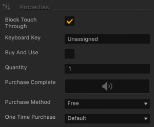
Block Touch Through If this button happens to be stacked on top of another button, and you don’t want the player to be able to tap the button underneath and trigger its action, select this check box.
Keyboard Key Typically applies to Windows exports. Type a key name that will activate the button when the user presses the specified key. In some scenarios, you may also associate it the Back button on the Android devices.
Buy And Use Select to use the purchased item immediately.
Quantity Enter the number of items to be purchased.
Purchase Complete Drag an MP3 file that you want to play to confirm a purchase. See also Adding Music and Sound Effects.
Purchase Method Select the type of payment for this purchase:

  • Free—the player will receive the desired items for free.
  • In Game Currency—the player will have to pay with the game currency.
  • In App Purchase—the player will need to make a purchase in an App Store.
  • Rewarded Videos—the player needs to watch a video.
One-Time Purchase Select to specify how often you want the player to make this purchase.

  • Default—player can make this purchase any number of times.
  • One-Time Purchase—player can purchase once, and will not be able to make this purchase again.
  • Pre-Game Purchase—player can only make this purchase before the game starts.

Navigation Button – Buildbox 3 Manual

By |

Navigation Button

Depending on the function you select for the button, add this button to create a Pause, Back, Restart, Reset Settings, or any other button on the screen. Just drag it from the Asset panel to the UI Editor and define the navigation button  attributes as described below.

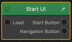
After you drag the button from the Asset panel to the Editor, an additional output appears in the corresponding UI node on the Mind Map. After you rename the button and customize its options, the name of this output will be updated accordingly.

NOTE: You can also add a Navigation button using the Buildbox menu. Go to Add > New Button and select an image you want to be used as a Navigation button.

Name and Transform Attributes

Option Description
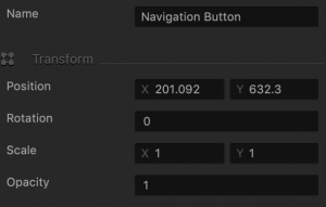
Name Enter a custom name for the button, if needed. It will be displayed in the Outliner.

TIP: Don’t leave this field blank, as you won’t be able to tell what button it is if you hide it.

Position Enter the appropriate values for each axis to specify a precise position for the button on the screen.

TIP: You can also drag the button to the desired location directly in the UI Editor.

Rotation Enter a degree value to specify the rotation angle of the button.
Scale Enter a value for each axis to make the button as proportionally large, or wide or narrow as needed.

TIP: You can also select the button in the UI Editor and drag its corner handles to resize it as needed.

Opacity Enter a value from 0 to 1 to specify the transparency of the button. For example, if you enter .5, the image will be semi-transparent.

Button Image Attributes

Option Description
Image Drag a PNG image for the button in its inactive state.
Image Selected Drag a PNG image for the button when it is selected.
Autohide If you want the button to appear momentarily and then fade away, specify the number of seconds for the button to be displayed for before disappearing.

To keep the button displayed on the screen, enter 0.

Stick to Edge Select this checkbox to keep the relative size and position of the button when scaling the screen for different sizes.
Additive Blending Select to add a glow effect overlay to any graphics or 3D objects underneath the button.

Sound and Other Properties

Option Description
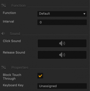
Function Select the appropriate function for the button:

  • Default
  • Pause—pauses the game.
  • Back—allows the player to go back to the previous world or UI screen.
  • Restart—restarts the game.
  • Review
  • Share—allows the player to share.
  • Restore Purchase
  • Game Services
  • Reset Settings
  • Fullscreen—Converts the game screen to a full screen view.
  • Windowed—Converts the game screen to a windowed view.
  • Exit— Exits the game
  • Custom

IMPORTANT: Make sure to connect the output to the appropriate input in the Mind Map.

Interval If you want the button to disappear after the player clicks it, enter the number of seconds, typically 1 or 2, after which the button should disappear.
Click Sound Drag an MP3 file with the sound to be made when the player taps the button. See also Adding Music and Sound Effects.
Release Sound Drag an MP3 file with the sound to be made when the player releases the button.
Block Touch Through If this button happens to be stacked on top of another button, and you don’t want the player to be able to tap the button underneath and trigger its action, select this check box.
Keyboard Key Typically applies to Windows exports. Type a key name that will activate the button when the user presses the specified key. In some scenarios, you may also associate it the Back button on the Android devices.


Facebook Button – Buildbox 3 Manual

By |

Facebook Button

Add this button to create a like for the logged in user, in their Facebook account. Just drag it from the Asset panel to the UI Editor and define the facebook button attributes as described below.

Name and Transform Attributes

Option Description
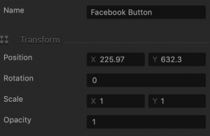
Name Enter a custom name for the button, if needed. It will be displayed in the Outliner.

TIP: Don’t leave this field blank, as you won’t be able to tell what button it is if you hide it.

Position Enter the appropriate values for each axis to specify a precise position for the button on the screen.

TIP: You can also drag the button to the desired location directly in the UI Editor.

Rotation Enter a degree value to specify the rotation angle of the button.
Scale Enter a value for each axis to make the button as proportionally large, or wide or narrow as needed.

TIP: You can also select the button in the UI Editor and drag its corner handles to resize it as needed.

Opacity Enter a value from 0 to 1 to specify the transparency of the button. For example, if you enter .5, the image will be semi-transparent.

Button Image Attributes

Option Description
Image Drag a PNG image for the button in its inactive state.
Image Selected Drag a PNG image for the button when it is selected.
Autohide If you want the button to appear momentarily and then fade away, specify the number of seconds for the button to be displayed for before disappearing.

To keep the button displayed on the screen, enter 0.

Stick to Edge Select this checkbox to keep the relative size and position of the button when scaling the screen for different sizes.
Additive Blending Select to add a glow effect overlay to any graphics or 3D objects underneath the button.

Sound and Other Properties

Option Description
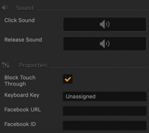
Click Sound Drag an MP3 file that plays when the player taps or clicks the button. See also Adding Music and Sound Effects.
Release Sound Drag an MP3 file that plays when the player releases the button.
Block Touch Through If this button happens to be stacked on top of another button, and you don’t want the player to be able to tap the button underneath and trigger its action, select this check box.
Keyboard Key Typically applies to Windows exports. Type a key name that will activate the button when the user presses the specified key. In some scenarios, you may also associate it the Back button on the Android devices.
Facebook URL Enter your game Facebook URL where a like will be created when the player taps this button.
Facebook ID When you create and register your app through Facebook, you will get a unique App ID. Enter your Facebook App ID here. If necessary, for details, see https://developers.facebook.com/docs/apps.


Audio Button – Buildbox 3 Manual

By |

Audio Button

Add an audio button to turn on and off the sound in your game. Just drag it from the Asset panel to the UI Editor and define the audio button attributes as described below. See also Adding Music and Sound Effects.

Name and Transform Attributes

Option Description
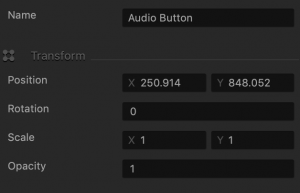
Name Enter a custom name for the button, if needed. It will be displayed in the Outliner.

Don’t leave this field blank, as you won’t be able to tell what button it is if you hide it.
Position Enter the appropriate values for each axis to specify a precise position for the button on the screen.

You can also drag the button to the desired location directly in the UI Editor.
Rotation Enter a degree value to specify the rotation angle of the button.
Scale Enter a value for each axis to make the button as proportionally large, or wide or narrow as needed.

You can also select the button in the UI Editor and drag its corner handles to resize it as needed.
Opacity Enter a value from 0 to 1 to specify the transparency of the button. For example, if you enter .5, the image will be semi-transparent.

Image Attributes

Option Description
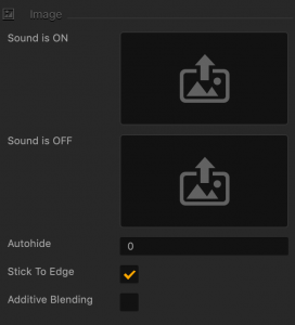
Sound is ON image Drag a PNG file for the button when the sound is on.
Sound is OFF Image Drag a PNG file for the button when the sound is off.
Autohide If you want the button to appear momentarily and then fade away, specify the number of seconds for the button to be displayed for before disappearing.

To keep the button displayed on the screen, enter 0.

Stick to Edge Select this checkbox to keep the relative size and position of the button when scaling the screen for different sizes.
Additive Blending Select to add a glow effect overlay to any graphics or 3D objects underneath the button.

Function and Properties Attributes

Option Description
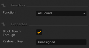
Function Select an option where your sound will take effect:

  • All Sound—All sounds effects and background music in the game.
  • Sound Effects—All sounds that play from the Sound nodes in an object’s Node Map.
  • Background Music—The Music fields associated with the UI nodes where you drop your MP3 files.
Block Touch Through If this button happens to be stacked on top of another button, and you don’t want the player to be able to tap the button underneath and trigger its action, select this check box.
Keyboard Key Typically applies to Windows exports. Type a key name that will activate the button when the user presses the specified key. In some scenarios, you may also associate it the Back button on the Android devices.

Asset Nodes – Buildbox 3 Manual

By |

Object and Character Nodes

About Asset Nodes

Each asset in the game has at least two nodes on its Node Map:

  • A Start node, which creates the character or object and enables its physics.
  • A 3D Model node, which defines the shape of a 3D asset or an Animation node, which defines the appearance of a 2D asset.

By default, the attributes of these nodes are displayed in the respective Options panel of the asset.

If you wish to make an asset in the game behave in a certain way in response to the player’s actions, for example, jump when touched or explode when it collides with an obstacle, you need to add the appropriate nodes to the Node Map of the asset.

You can now easily add the desired movements and other behaviors to an asset by using the Add Brain Box button at the bottom of the Options panel of the asset. This automatically adds a predefined group of nodes to the asset based on your box selection.

Similarly, if you want to modify the game flow logic, for example, by randomizing transitions to new levels or by locking certain levels until the user unlocks them, you need to use nodes. For example, see Health, Damage, and Defeat.

Node Categories

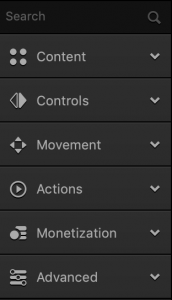
There are six node categories that include dozens of nodes that you can use to define any scenario you can imagine. These categories are located in the Node Panel to the left of the Node Map  and are listed in the table below.

For details on accessing the Node Map and adding nodes to it, see Node Map Workspace.

Node Category Icon Description Node Category Color
Content Nodes that allow you to define the appearance and shape of the selected object or character and add special effects, such as animation, sounds, text, and so on.
Controls Nodes that allow you to define the player interactions with the object during the game.
Movement Nodes that allow you to define the movements of the character or object during the game, for example, jumping, bouncing, floating, and so on.
Actions Nodes that allow you to perform actions on the character or object during the game, for example, to define how to handle collisions, health, damage, defeat, set checkpoints, control the camera, and much more.
Monetization Nodes that allow you to generate revenue from the dame, for example, by adding ads or game purchases. For details, see Ad Monetization.
Advanced Nodes that allow you to perform advanced actions, such as terminating your character, create custom script nodes, and so on.