In the world of hypercasual getting the adverts right is a huge key to success, and it’s why we have a dedicated creative team to make our ads here at Kwalee. We want to share some of our knowledge with you to help you get your ad creative right and get more people playing your games!
So what makes a brilliant advert? First off, let’s get technical. In most cases, your ads are going to be watched by someone holding their phone upright, so we recommend using portrait ads, with a 4:5 ratio and 1080 x 1350 pixels. Within that sizing, you’ll also need to ensure that the game footage takes up the whole area, and that there’s no blank space around the top or sides. Imagine a viewer sitting at their desk, drinking their coffee, and scrolling through Facebook. When they see your ad it needs to pop and draw them in! If the gameplay isn’t dominating that screen, then they’ll glance over it.

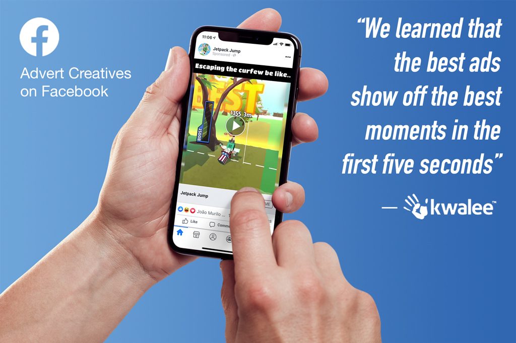
We learned that the best ads show off the best moments in the first five seconds and are no longer than 15 seconds in TOTAL. Be sure to capture the very best moments of gameplay, as well as ensuring the visuals aren’t too busy or cluttered – remember this is going to be watched on a small phone screen and not at the IMAX!
Pretty simple, right? So what about the content?
First off, you need to pay attention to your gameplay footage’s first five seconds and ask, is this going to capture someone’s attention? Those first 5 seconds are what will ignite someone’s interest in your game, so make sure it’s compelling! Use the advert to show off what makes your game great and unique and help the viewer understand the aim of the whole game. What is the game about? Is there a clear objective? What are the key moments within it?
Be sure to show this cause and effect, so any potential player has a clear understanding of what it’s all about and how they’re going to play the game. Something that can help the player engage with the game and understand how simple it is to play is to use a hand or finger icon that mimics the ‘taps’ and ‘presses’ the player has to make. This simplicity is crucial to the success of hypercasual games!
The next thing to focus on is visualizing the actual challenge of the game. What do they need to beat or achieve? How can they do better than what they’re seeing in the ad? Some of the best ads show extreme and even frustrating failures that encourage the viewer to do better.

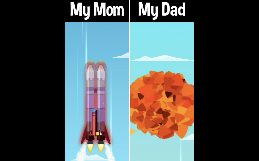
A method that we’ve found really works when communicating this, is to use memes or split-screen ‘Mom vs. Dad’ style videos. These kinds of videos feature two gameplay recordings side by side, showcasing the same level or section of the game but played very differently – usually contrasting how an absolute pro should play with a complete novice that fails at every turn. You can be creative with your captions, so although Mom and Dad work particularly well, you shouldn’t feel limited to this, but the key is to make the ad relatable and remind viewers that this gameplay comes from real people. This way, you’ll have an ad that captures attention early on, puts across the key moments of gameplay, and challenges the player to become a pro themselves!
For visuals, it’s good to remember, less can be more. It’s worth choosing one goal for your ad and sticking to it, rather than overloading a single 15 seconds with too much information. For instance, don’t pair up a Mom vs. Dad style ad with hand icons and other text, as things will get confusing. Let the gameplay do the talking. At Kwalee, we create and test multiple ads for each game to see what approach works best and to avoid a single ad being too busy.
Try the same, remember those technical requirements mentioned , and really focus on those moments that will make your game stand out. It’ll make a world of difference when it comes to attracting players to your hypercasual creations!
When you’re preparing ads for a test with Kwalee, remember you can ask a member of our publishing team to give you advice and feedback on your videos – we’re happy to help!


