As many of you will know, showing off your game with a great video is absolutely vital to find a big audience. Think about the last mobile game you became addicted to, and there’s a high likelihood that a video enticed you in the first place.
That’s why here at Kwalee, we spend so much time thinking about how best to showcase our unique gameplay ideas in ads – and how to help developers like you do the same!
Today we’re going to explore the topic of making a good video for a CPI test. A CPI test is the first step in the publishing journey, and in essence, it’s a test to see if your game’s core mechanic is something players like enough to download.
Best of all, there’s no reason to wait until your game is finished to make a video for a CPI test! You’ll need only around 4-10 levels, enough for the game to be approved by the app stores and to make an enticing short video from. That also makes this the perfect formula to follow when making a video for your game jam entry!
So, what is CPI?
CPI, or Cost Per Install, is the amount of money spent to acquire a single new player of your game. A low CPI means that your game has found an audience of players and looks interesting enough from its video to encourage lots of people to download it.
It then opens the door to future testing, adding more content for future tests and, ultimately, global launch. A low CPI (under $0.25) also gets publishers like us very excited!
Video Requirements
- 1080×1350 in size
- 15 seconds long (no more or less)
- Three videos: One showing ‘fail’ gameplay which makes viewers want to try for themselves and do better; one showing more standard gameplay and one showing a mix – a common formula being ‘Mom vs. Dad’ videos, which feature a split screen of the same level being played in different ways.
- Your video doesn’t need sound or music.
The Creative Challenge
People will typically watch your game advert for 3-5 seconds. It’s a small window to convince them to download your game, so the start of your advert is crucial. We generally recommend you consider ‘What will my advert be?’ during the first phase of your game design as it is important to consider this from an early stage.
It’s great to have a game idea, but what will be the advert that sells it?
- What are the controls?
- How do I die?
- Where’s the physicality? Physicality is generally the key to a good ad. Physical interaction between the characters and world creates a sense of dynamic depth that is eye-catching and appealing.
Number Dash: The story of reducing the CPI
Through our partnership with Buildbox, we work very closely with boxers on a daily basis to cover a variety of subjects, offering our help and support where we can. An example of this would be Dead Fly Studios’ recent Number Dash.
Let’s look at some Number Dash creatives to show how some very simple changes can make a massive difference when it comes to the impact of videos. A huge thanks to Leighton for allowing us to use his game and video as an example for this topic!
The First Test
When we first tested Number Dash, we knew that there was something very cool with the game mechanic but felt with some changes; we could further improve whatever CPI came from the first test.
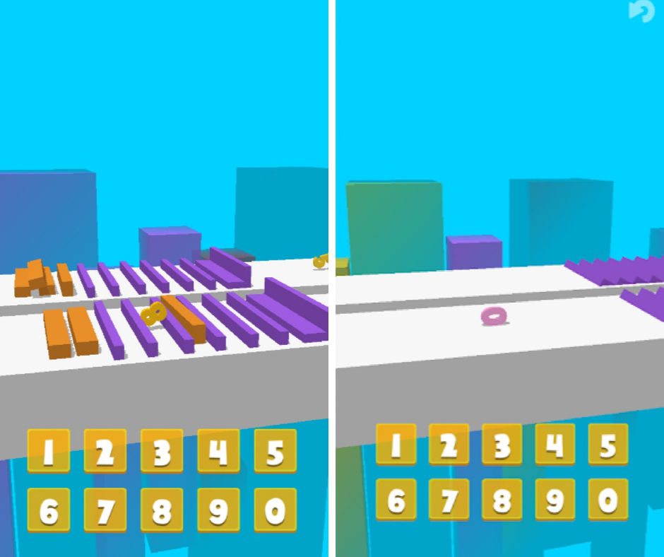
Screenshots from the first CPI test:

The video you see above is what we used for the first test, and as you can see, it looks like a lot of fun! However, it still came back with a high CPI, and so we identified many factors that played a part in this. We focused on addressing these issues, the most important examples being the camera angle, the colors, and making the gameplay mechanic appear smoother and yet more frustrating – which may sound strange. Still, it’s the key to a good ‘fail’ video!
The Process
Kwalee worked closely with Leighton over a few video calls and daily conversations over Discord. We sent Leighton some reference material (screenshots, videos) with some tips for color choices, camera angles, and other ways we could improve the game.
The result is the video below:
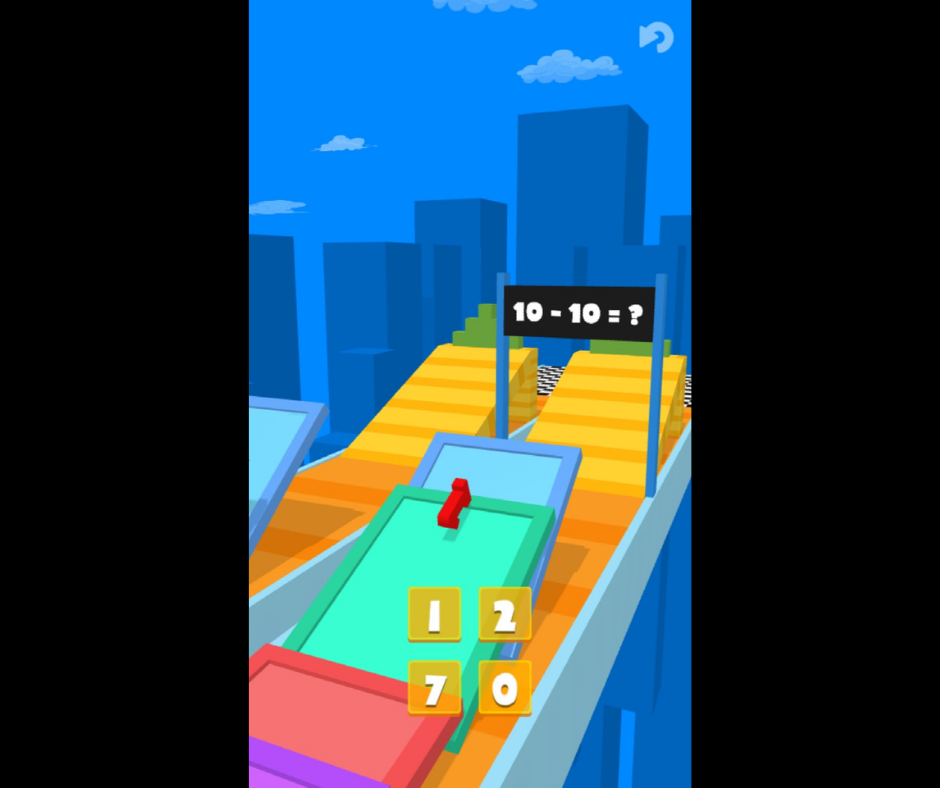
Second test screenshot:
 “Leighton worked really hard to implement the changes. It was reassuring that he delivered regular updates through the day to ensure we had a rapid turnaround. Strong communication is king!” – George@Kwalee
We addressed the flat color palette, thanks to the help of Buildbox, to make the colors pop. Then, we decluttered the game UI to reduce the number of numbers to press and make the whole experience look cleaner.
The biggest change was the camera angle. We wanted to show more of the track, so the player could see any hazards and track ahead, allowing time to react. As you can see, it makes everything look so much more dynamic.
One of the most important changes was adding the overhead hint board, with sums adding up to the ideal number to use in each section. Not only did it demonstrate to the player the best way to overcome the obstacle, but it also added a visual tutorial for the CPI video and showed another layer of problem-solving and strategy to the game.
After almost an entire week’s worth of work and some great communication between Leighton and us, the final result is about to enter a new CPI test. Within the first few seconds of the gameplay, you can already see how much clearer the game’s core mechanic is.
With just a few more impactful moments, it now stands a much greater chance of achieving a low CPI, and we know full well that sometimes it’s the small changes that count – you can read about how our hit game Rocket Sky! (30 million+ downloads) halved its CPI with a simple UI change here!
So we hope that this has been a useful introduction to making great videos for CPI tests and how you can easily make a video that really stands out. There’s still plenty of time to enter our ‘Attraction’ game jam and win some great prizes, or even a publishing deal, so grab some footage from your entry and make a killer video!


